by Rachel Russell, Graphic Designer
We’re back with the next instalment of our design diaries — following graphic designer Rachel as she develops a new look for Clark. This week, we’re looking at the redesign of the brand…
Concepts
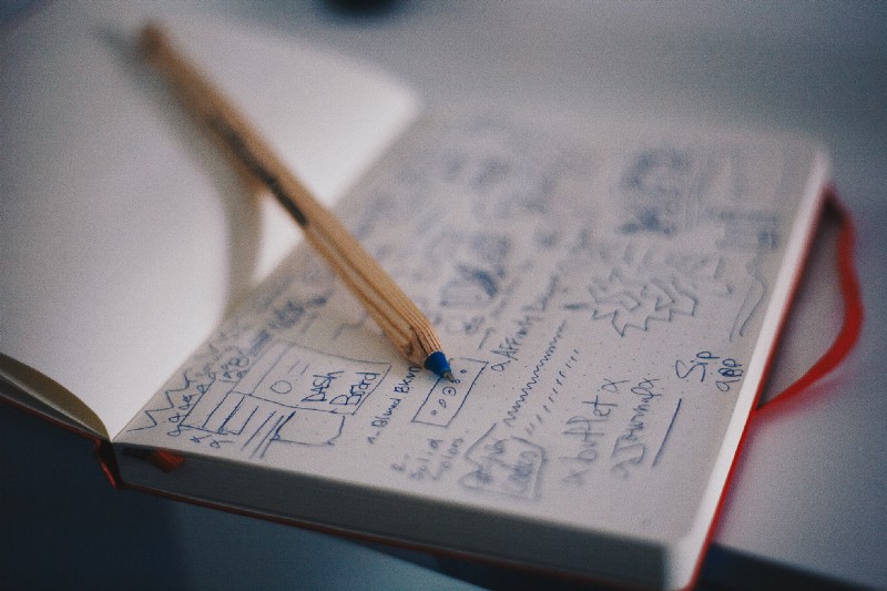
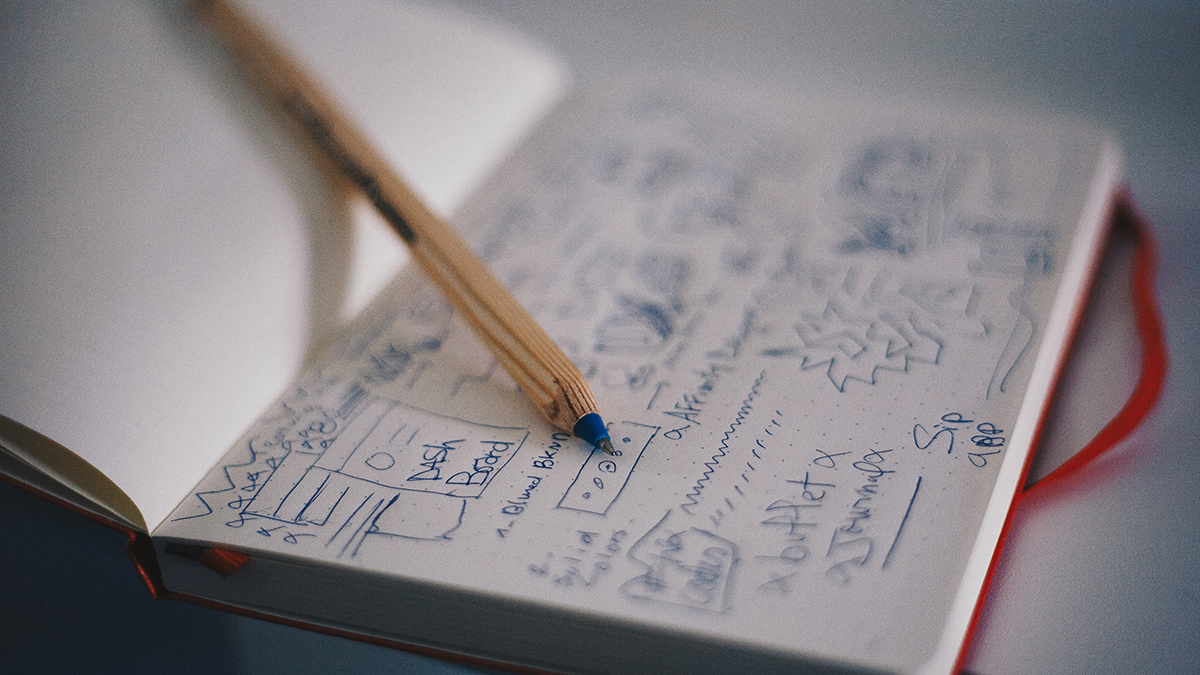
Once I have a pretty good idea of what the client is looking for it’s time to get old school and get out a pencil and paper. I tend to start out with a kind of spider diagram where I write down every idea connected to the brief, whether it’s thoughts on imagery, typography, colour or just words that spring to mind when I think about the client and their project. I get it all down on one big, messy page as quickly as I can.
Then I start to pick out ideas that can be developed into concepts. Still with my pencil and paper I start to sketch very rough ideas allowing me to check quickly and easily if the idea in my head works on the page. It also allows me to quickly rework ideas until they start to look right. From here I whittle down the pages of rough ideas into a few concept groups and begin to recreate the sketches in Adobe Illustrator, making choices about imagery, form and typography as I go. I don’t work with colour until later as it’s really easy to get distracted by it and it’s also important that a design works well in black and white.
Review
Having spent some time working on concepts I start with a fresh art board in Illustrator and take a selection of the strongest ideas which represent a fairly broad range of concepts. From something fairly close to what I think the client has in mind to a few curve balls, it’s good not to play it too safe at this stage.
The only rule is never to include anything I don’t think is strong enough -send something you’re not happy with to the client and you can guarantee it will be selected — it’s sod’s law!
Now I’m ready to present the concepts to the client for their feedback. In an ideal world the client will see a direction that they love and want to pursue, however, sometimes it’s a matter of developing a couple of directions further or combining elements from several designs. In the case of our own branding, our directors independently selected the same concepts, so I knew we were onto a winner. It’s not always as simple though.
Development
Once I have client feedback I begin to develop the logo concepts. This process includes taking onboard any feedback from the client, thinking further about type choices, refining imagery and beginning to think more about the broader applications of the design in print and on the web, how it will be used and if different variations of the logo will be required.
I also begin to think about colour at this stage and about a supporting palette of colours and typography. Then the work is ready to go back to the client for further feedback. We were all in immediate agreement with the final concept, and a little flourish here and there, then we were good to go.
Finalising
The final stage of the process is fleshing out the entire brand around the logo. For some clients this can mean a relatively simple brand guide showing colour values, logo variations and type choices. For other clients this can be quite a complex process requiring a lengthy brand book and the development of additional design collateral for example patterns and icons.
At Clark we’re planning a brand book which ties together the design elements of the brand with our brand values and ‘voice’ so that all team members, and future employees, have a go-to document that helps create consistent and on brand content.
The requirements may vary but the goal is always to provide the client with a stylish and user friendly brand which perfectly communicates to their audience who they are and what they do.
See you next time for The Web Design Process…